RNA-Seq data analysis, clustering and visualisation tutorial
Under Development!
This tutorial is not in its final state. The content may change a lot in the next months. Because of this status, it is also not listed in the topic pages.
| Author(s) |
|
| Editor(s) |
|
| Reviewers |
|
OverviewQuestions:
Objectives:
How to identify differentially expressed genes across multiple experimental conditions?
What are the biological functions impacted by the differential expression of genes?
How to visualise high-dimensional data
How to cluster similar samples and genes?
Requirements:
To learn the principles of the analysis and visualisation of a multidimensional data analysis. We will use RNA-seq data as an example of a multidimensional -omics dataset.
- Introduction to Galaxy Analyses
- slides Slides: Quality Control
- tutorial Hands-on: Quality Control
- slides Slides: Mapping
- tutorial Hands-on: Mapping
Time estimation: 6 hoursLevel: Introductory IntroductorySupporting Materials:Published: May 28, 2025Last modification: Jun 8, 2026License: Tutorial Content is licensed under Creative Commons Attribution 4.0 International License. The GTN Framework is licensed under MITpurl PURL: https://gxy.io/GTN:T00547rating Rating: 3.0 (0 recent ratings, 1 all time)version Revision: 9
In this computer assignment, we will analyze the results of an RNA-seq dataset. This is one type of high-dimensional -omics data that biomedical scientists frequently use. The raw RNA-seq data are sequence reads, but we will use the processed data from an RNA-seq experiment, often referred to as a count matrix. A count matrix contains for every sample (in the columns of the matrix) and every gene or transcript (in the rows of the matrix) the number of sequencing reads representing that gene or transcript (an integer, i.e., 0, 1, 2, 3, …). The expression level of that gene is derived from the read count by correcting (normalization) for the total number of sequencing reads in a particular sample.
RNA-seq is often used to explore the function of a gene or the effect of a genetic variant. Since RNA-seq can survey the expression levels of all genes, it is well suited to obtain a global idea of the effect on the physiology of a cell and the biological processes affected. In this computer assignment, we will explore a dataset from mouse B-cells from TP53-/- knockout and wild-type mice. It is a two-factor experiment, because cells of both genotypes have been analyzed with or without being exposed to ionizing radiation (IR); thus, genotype and exposure to IR represent different factors in the experiment. The research paper describing this dataset is Tonelli et al. 2015 (direct link). The TP53 gene coding for the p53 protein is a well-known tumor suppressor gene. p53 is involved in the induction of apoptosis, senescence, cell cycle arrest and metabolic reprogramming. p53 is activated by double strand DNA breaks and routes cells to apoptosis when the DNA damage cannot be repaired anymore. TP53 mutation is one the most common driver of mutations in cancer, because TP53-deficient cells continue to proliferate, even after significant DNA damage. IR induces double strand DNA breaks and cell death (apoptosis) and is a well-known activator of p53. The authors used TP53-/- cells and wild-type cells to explore which part of the response of B-cells to IR is dependent on p53.
Comment: Full dataThe original data are available at NCBI Gene Expression Omnibus (GEO) under accession number GSE71176. The raw RNA-Seq reads have been extracted from the Sequence Read Archive (SRA) files and converted into FASTQ files and counts.
Data upload
In the first part of this tutorial we will upload the count matrices to your Galaxy environment.
Hands On: Data upload
Create a new history for this RNA-Seq exercise
To create a new history simply click the new-history icon at the top of the history panel:
Import the count files from our github repository using the Data Upload menu (top left) and the button Paste/Fetch Data.
https://raw.githubusercontent.com/pacthoen/BMW2_RNA_clust_vis/refs/heads/main/data/p53_mock_1.csv
https://raw.githubusercontent.com/pacthoen/BMW2_RNA_clust_vis/refs/heads/main/data/p53_mock_2.csv
https://raw.githubusercontent.com/pacthoen/BMW2_RNA_clust_vis/refs/heads/main/data/p53_mock_3.csv
https://raw.githubusercontent.com/pacthoen/BMW2_RNA_clust_vis/refs/heads/main/data/p53_mock_4.csv
https://raw.githubusercontent.com/pacthoen/BMW2_RNA_clust_vis/refs/heads/main/data/p53_IR_1.csv
https://raw.githubusercontent.com/pacthoen/BMW2_RNA_clust_vis/refs/heads/main/data/p53_IR_2.csv
https://raw.githubusercontent.com/pacthoen/BMW2_RNA_clust_vis/refs/heads/main/data/p53_IR_3.csv
https://raw.githubusercontent.com/pacthoen/BMW2_RNA_clust_vis/refs/heads/main/data/p53_IR_4.csv
https://raw.githubusercontent.com/pacthoen/BMW2_RNA_clust_vis/refs/heads/main/data/null_mock_1.csv
https://raw.githubusercontent.com/pacthoen/BMW2_RNA_clust_vis/refs/heads/main/data/null_mock_2.csv
https://raw.githubusercontent.com/pacthoen/BMW2_RNA_clust_vis/refs/heads/main/data/null_IR_1.csv
https://raw.githubusercontent.com/pacthoen/BMW2_RNA_clust_vis/refs/heads/main/data/null_IR_2.csv
- Copy the link location
Click galaxy-upload Upload at the top of the activity panel
- Select galaxy-wf-edit Paste/Fetch Data
Paste the link(s) into the text field
Press Start
- Close the window
See also this screenshot
Note: The files with null in the filename are for the p53 knockout (p53-/-) cells and the files with p53 in the filename are for the wild-type cells
Alternative: If this results in an error, you may download the zip file with all the input data from the github site to your local computer, unzip and import all the files using the Choose local file option from the Upload menu.
- Inspect galaxy-eye some of the files by hitting they eye button
Upload also the gene annotation file:
https://raw.githubusercontent.com/pacthoen/BMW2_RNA_clust_vis/refs/heads/main/data/Mus_musculus.NCBIM37.65.gtf.gzAlternative Like before, if this results in an error, you can download the gtf.gz file from the github site to your local computer and import the gtf.gz file (no need for unzipping) using Choose local file option from the Upload menu
Note: The numbers in the count files are the number of sequence reads to a specific gene. Only mRNAs that were detected in all samples were selected during the preprocessing of the data.
Set the datatype galaxy-pencil of the annotation file to
gtf.gz
- Click on the galaxy-pencil pencil icon for the dataset to edit its attributes
- In the central panel, click galaxy-chart-select-data Datatypes tab on the top
- In the galaxy-chart-select-data Assign Datatype, select
gtf.gzfrom “New Type” dropdown
- Tip: you can start typing the datatype into the field to filter the dropdown menu
- Click the Save button
Question
- How many mRNAs were detected in all samples?
1.By clicking on the dataset you can see the attributes of the dataset. There are 6,882 lines and a comment line in the files containing the count data. Thus, there are 6,882 detectable mRNAs in the dataset


Analysis of the differential gene expression
Identification of the differentially expressed features
To be able to identify differential gene expression between wild-type and p53-null cells and between IR- and mock-treated cells, we need to normalise our data first. In the lecture you have seen TPM and RPKM normalization. Here we use a bit more advance way of normalizing data using the Variance Stabilization and Transformation (VST) method from the DESeq2 package and tool. (see DESeq2 documentation). DESeq2 also runs the Differential Gene Expression (DGE) analysis, which has two basic tasks:
- Estimate the biological variance using the replicates for each condition
- Estimate the significance of expression differences between any two conditions
This expression analysis is estimated from read counts and attempts are made to correct for variability in measurements using replicates, that are absolutely essential for accurate results.
A technical replicate is an experiment which is performed once but measured several times (e.g. multiple sequencing of the same library). A biological replicate is an experiment performed (and also measured) several times.
In our data, we have 2-4 biological replicates (here called samples) per condition.
Question
- How many conditions are there in this experiment and what is the number of replicates in each of the conditions?
1.There are 4 conditions
- Wild-type cells not exposed to IR - 4 replicates
- Wild-type cells exposed to IR - 4 replicates
- TP53-/- cells not exposed to IR - 2 replicates
- TP53-/- cells exposed to IR - 2 replicates
Multiple factors with several levels can then be incorporated in the analysis describing known sources of variation (e.g. treatment, tissue type, gender, batches), with two or more levels representing the conditions for each factor. After normalization we can compare the response of the expression of any gene to the presence of different levels of a factor in a statistically reliable way.
In our example, we have samples with two varying factors that can contribute to differences in gene expression:
- Genotype (either wild-type or knock-out)
- Treatment (either IR or mock)
The effect of Ionizing Radiation (IR) is our primary interest. Later on, we will explore the differences in IR response between wild-type and knock-out cells and which genes are dependent on p53 for their response to IR. We will now assign each sample to the right group
We can now run DESeq2:
Hands On: Determine differentially expressed features
- DESeq2 ( Galaxy version 2.11.40.8+galaxy0) with the following parameters:
- “how”:
Select datasets per level
- In “Factor”:
- “Specify the factor name”:
Treatment- In “1: Factor level”:
- “Specify the factor level”:
IR- In “Count file(s)”:
Select all the IR treated count files. Note1: Use the Switch to column select option to select the files. Note2: The first factor level is compared to the second factor level. In this case IR vs. mock. See this Screenshot- In “2: Factor level”:
- “Specify the factor level”:
Mock- In “Count file(s)”:
Select all the mock treated count files- param-repeat “Insert Factor”
- “Specify the factor name”:
Genotype
- In “Factor level”:
- param-repeat “Insert Factor level”
- “Specify the factor level”:
KO- In “Count file(s)”:
Select all the KO count files.i.e. those with null in the file name- param-repeat “Insert Factor level”
- “Specify the factor level”:
WT- In “Count file(s)”:
Select all the WT count filesi.e. those with p53 in the file name- “Files have header?”:
Yes- “Choice of Input data”:
Count data (e.g. from HTSeq-count, featureCounts or StringTie)- In “Advanced options”:
- “Use beta priors”:
Yes- In “Output options”:
- “Output selector”:
Generate plots for visualizing the analysis results,Output normalised counts,Output VST normalized table
DESeq2 tool generated 4 outputs:
- A table with the normalized counts for each gene (rows) in the samples (columns)
-
A graphical summary of the results, useful to evaluate the quality of the experiment:
-
A plot of the first 2 dimensions from a principal component analysis
-
Heatmap of the sample-to-sample distance matrix (with clustering) based on the normalized counts.
The heatmap gives an overview of similarities and dissimilarities between samples: the color represents the distance between the samples. Dark blue means shorter distance, i.e. closer samples given the normalized counts.
-
Dispersion estimates: gene-wise estimates (black), the fitted values (red), and the final maximum a posteriori estimates used in testing (blue)
This dispersion plot is typical, with the final estimates shrunk from the gene-wise estimates towards the fitted estimates. Some gene-wise estimates are flagged as outliers and not shrunk towards the fitted value. The amount of shrinkage can be more or less than seen here, depending on the sample size, the number of coefficients, the row mean and the variability of the gene-wise estimates.
-
Histogram of p-values for the genes in the comparison between the 2 levels of the 1st factor
-
An MA plot:
This displays the global view of the relationship between the expression change of conditions (log ratios, M), the average expression strength of the genes (average mean, A), and the ability of the algorithm to detect differential gene expression. The genes that passed the significance threshold (adjusted p-value < 0.1) are colored in blue.
-
-
A summary file with the following values for each gene:
- Gene identifiers
- Mean normalized counts, averaged over all samples from both conditions
-
Fold change in log2 (logarithm base 2)
The log2 fold changes are based on the primary factor level 1 vs factor level 2, hence the input order of factor levels is important. Here, DESeq2 computes fold changes of ‘treated’ samples against ‘untreated’ from the first factor ‘Treatment’, i.e. the values correspond to up- or downregulation of genes in treated samples.
- Standard error estimate for the log2 fold change estimate
- Wald statistic
- p-value for the statistical significance of this change
- p-value adjusted for multiple testing with the Benjamini-Hochberg procedure, which controls false discovery rate (FDR)
The p-value is a measure often used to determine whether or not a particular observation possesses statistical significance. Strictly speaking, the p-value is the probability that the data could have arisen randomly, assuming that the null hypothesis is correct. In the concrete case of RNA-Seq, the null hypothesis is that there is no differential gene expression. So a p-value of 0.13 for a particular gene indicates that, for that gene, assuming it is not differentially expressed, there is a 13% chance that any apparent differential expression could simply be produced by random variation in the experimental data.
13% is still quite high, so we cannot really be confident differential gene expression is taking place. The most common way that scientists use p-values is to set a threshold (commonly 0.05, sometimes other values such as 0.01) and reject the null hypothesis only for p-values below this value. Thus, for genes with p-values less than 0.05, we can feel safe stating that differential gene expression plays a role. It should be noted that any such threshold is arbitrary and there is no meaningful difference between a p-value of 0.049 and 0.051, even if we only reject the null hypothesis in the first case.
Unfortunately, p-values are often heavily misused in scientific research, enough so that Wikipedia provides a dedicated article on the subject. See also this article (aimed at a general, non-scientific audience).
For more information about DESeq2 and its outputs, you can have a look at the DESeq2 documentation.
- An output file with Normalized counts
- An output file with VST-Normalized counts (VST stands for Variance Stabilization and Transformation; this is the preferred normalization method in DESeq2 and we will use these counts later on for PCA and clustering
Use the filter tool tool on the DESeq2 result file to identify the genes with absolute fold-change greater than 2. Use the condition: abs(c3)>2. Number of header lines to skip: 1. See this Screenshot. And use the sort tool to identify the genes with the largest fold-change (most upregulated). See this Screenshot
Question
- What does it mean when an mRNA has an absolute 2logFC greater than 2?
- How many mRNAs have an absolute 2logFC greater than 2?
- What is the mRNA that is most upregulated in IR- vs mock-treated cells and what is its false discovery rate (the chance that this is a false positive)?
- That the genes is 2^2 = 4 times higher or lower expressed in the cells treated with IR than in mock-treated cells
- 666 (!)
- ENSMUSG00000000308; FDR is in p-adj column. It is 1.3*10^-26
Annotation of the DESeq2 results
The ID for each gene is something like ENSMUSG00000026581, which is an ID from the Ensembl gene database. These IDs are unique but sometimes we prefer to have the gene names, even if they may not reference an unique gene (e.g. duplicated after re-annotation). But gene names may hint already to a function or they help you to search for desired candidates. We would also like to display the location of these genes within the genome. We can extract such information from the annotation file which we uploaded before.
Hands On: Annotation of the DESeq2 results
- Annotate DESeq2/DEXSeq output tables ( Galaxy version 1.1.0) with:
- param-file “Tabular output of DESeq2/edgeR/limma/DEXSeq”: the filtered and sorted
DESeq2 result file(output of DESeq2 tool)- “Input file type”:
DESeq2/edgeR/limma- param-file “Reference annotation in GFF/GTF format”: imported gtf
Annotation file- See this Screenshot
The generated output is an extension of the previous file:
- Gene identifiers
- Mean normalized counts over all samples
- Log2 fold change
- Standard error estimate for the log2 fold change estimate
- Wald statistic
- p-value for the Wald statistic
- p-value adjusted for multiple testing with the Benjamini-Hochberg procedure for the Wald statistic
- Chromosome
- Start
- End
- Strand
- Feature
- Gene name
Question
- What is the Gene Symbol of the most overexpressed gene
- On which chromosome is the most over-expressed gene located?
- ENSMUSG00000000308 (the top-ranked gene with the highest positive log2FC value)
- It is located on the reverse strand of chromosome 2, between 121183449 bp and 121189473 bp.
The annotated table contains no column names, which makes it difficult to read. We would like to add them before going further.
Hands On: Add column names
In the Upload menu, create a new file using the Paste/Fetch data option form the Upload menu, by directly pasting in the line below in the white area, and call it
headerinstead ofNew FileGeneID Base mean log2(FC) StdErr Wald-Stats P-value P-adj Chromosome Start End Strand Feature Gene name
- Click galaxy-upload Upload Data at the top of the tool panel
- Select galaxy-wf-edit Paste/Fetch Data at the bottom
Paste the file contents into the text field
- Change the dataset name from “New File” to
header- Change Type from “Auto-detect” to
tabular* Press Start and Close the windowSee this Screenshot
- Concatenate multiple datasets or collections to add this header line to the Annotate output:
- param-file “Concatenate Dataset”: the
headerdataset- “Dataset”
- Click on param-repeat “Insert Dataset”
- param-file “select”: output of Annotate tool
- Rename the output to
Annotated DESeq2 results
Create Volcano plot to visualise differentially expressed genes
Hands On
- Select the tool Volcano Plot In a Volcano plot, the 2logFC (x-axis) is plotted against the -log10(P-value).
- Choose the right column numbers. See this Screenshot. Change the significant threshold to 0.05 and LogFC 2 as thresholds to colour.
- Put in correct titles under Plot options.
- Repeat the DESeq2 analysis but now with
Genotypeas first factor (contrasting KO and WT cells). Repeat the Volcano plot.Question
- Is IR causing more up- or more downregulation of gene expression?
- Does the Treatment or the Genotype have a bigger effect on gene expression
- There are more mRNA upregulated than downregulated. The upregulated genes can be found on the right side of the plot.
- There are more mRNA with high FC and strong significance in the comparison between IR and mock-treated cells than between KO and WT cells.
Functional enrichment analysis of the DE genes
We have extracted genes that are differentially expressed in IR- vs. mock-treated samples. Now, we would like to know if the differentially expressed genes are enriched transcripts of genes which belong to more common or specific categories in order to identify biological functions that might be impacted.
Gene Ontology analysis
Gene Ontology (GO) analysis is widely used to reduce complexity and highlight biological processes in genome-wide expression studies. However, standard methods give biased results on RNA-Seq data due to over-detection of differential expression for long and highly-expressed transcripts.
goseq (Young et al. 2010) provides methods for performing GO analysis of RNA-Seq data while taking length bias into account. goseq could also be applied to other category-based tests of RNA-Seq data, such as KEGG pathway analysis, as discussed in a further section.
goseq needs 2 files as inputs:
- A tabular file with the differentially expressed genes from all genes assayed in the RNA-Seq experiment with 2 columns:
- the Gene IDs (unique within the file), in uppercase letters
- a boolean indicating whether the gene is differentially expressed or not (
Trueif differentially expressed orFalseif not). We will use abs(2LogFC) > 2 as a criterion
- A file with information about the length of a gene to correct for potential length bias in differentially expressed genes
Hands On: Prepare input for goseq
- Use the Gene length and GC content tool on the Annotation file (gtf format). See this screenshot
- “Analysis to perform”:
gene lengths only- Merge the gene length and the DESeq2 result file DESeq2 result file with primary factor Treatment using the Join two files tool. In “Keep the header lines”:
No. See this Screenshot- Use the Compute on rows tool to create a column with TRUE and FALSE using the following expression:
bool(float(c3)>2). In the “Error handling” choose in “Autodetect column types”Noand “Fail on references to non-existent columns”Noand “If an expression cannot be computed for a row” chooseFill in a replacement valueand Replacement valueFalse. See this screenshot- Cut columns from a table with the following parameters:
- “Cut columns”:
c1,c9- “Delimited by”:
Tab- param-file “From”: the output generated in step 3
- Rename the output to
Gene IDs and differential expression - IR- Cut columns from a table with the following parameters:
- “Cut columns”:
c1,c8- “Delimited by”:
Tab- param-file “From”: the output generated in step 3
- Rename the output to
Gene length differential expression - IR
We have now the two required input files for goseq.
Hands On: Perform GO analysis
- goseq ( Galaxy version 1.50.0+galaxy0) with
- “Differentially expressed genes file”:
Gene IDs and differential expression- “Gene lengths file”:
Gene IDs and length- “Gene categories”:
Get categories
- “Select a genome to use”:
mouse (mm10)- “Select Gene ID format”:
Ensembl Gene ID- “Select one or more categories”:
GO: Cellular Component,GO: Biological Process,GO: Molecular Function- In “Output Options”
- “Output Top GO terms plot?”:
Yes- “Extract the DE genes for the categories (GO/KEGG terms)?”:
Yes
goseq generates with these parameters 3 outputs:
-
A table (
Ranked category list - Wallenius method) with the following columns for each GO term:category: GO categoryover_rep_pval: p-value for over-representation of the term in the differentially expressed genesunder_rep_pval: p-value for under-representation of the term in the differentially expressed genesnumDEInCat: number of differentially expressed genes in this categorynumInCat: number of genes in this categoryterm: detail of the termontology: MF (Molecular Function - molecular activities of gene products), CC (Cellular Component - where gene products are active), BP (Biological Process - pathways and larger processes made up of the activities of multiple gene products)p.adjust.over_represented: p-value for over-representation of the term in the differentially expressed genes, adjusted for multiple testing with the Benjamini-Hochberg procedurep.adjust.under_represented: p-value for under-representation of the term in the differentially expressed genes, adjusted for multiple testing with the Benjamini-Hochberg procedure
To identify categories significantly enriched/unenriched below some p-value cutoff, it is necessary to use the adjusted p-value.
Question- How many GO terms are over-represented with an adjusted P-value < 0.05? How many are under-represented?
- Do you find evidence that p53 plays a role in the response to IR?
- 5 GO terms (4 from the Biological Processes category, 1 from the Molecular Function category) are over-represented.
-
Signal transduction by p53 class mediator is second in rank and contains 19 differentially expressed genes. Filter data on any column using simple expressions on c8 (adjusted p-value for over-represented GO terms) and c9 (adjusted p-value for under-represented GO terms)
-
For over-represented, 50 BP, 5 CC and 5 MF and for under-represented, 5 BP, 2 CC and 0 MF
Group data on column 7 (category) and count on column 1 (IDs)
-
A graph with the top 10 over-represented GO terms
QuestionWhat is the x-axis? How is it computed?
The x-axis is the percentage of genes in the category that have been identified as differentially expressed: \(100 \times \frac{numDEInCat}{numInCat}\)
-
A table with the differentially expressed genes (from the list we provided) associated to the GO terms (
DE genes for categories (GO/KEGG terms))
Comment: Advanced tutorial on enrichment analysisIn this tutorial, we covered GO enrichment analysis with goseq. You can also use the same method to identify metabolic and signal transduction pathways from the KEGG database (do not select plotting the Top GO pathways in that case). To learn other methods and tools for gene set enrichment analysis, please have a look at the “RNA-Seq genes to pathways” tutorial.
Visualisation of high-dimensional datasets
In the second part of this computer assignment we will use commonly used techniques to identify the main sources of variation and to evaluate which samples and sample groups are most similar. We will continue using the same dataset but first filter for the most variable genes. This is for computational efficiency and to reduce the effect of noise.
Filter for most variable genes
For filtering the most variable genes, we will compute the coefficient of variation (CV). This is defined as the standard deviation divided by the mean.
Hands On: Filter for most variable genes
- Use the the Table compute tool to calculate the standard deviation (std)
- “Table”:
VST normalized data- “Input data has”:
Column names on the first rowandRow names on the first column- “Type of table operation “:
Compute expression across rows or columns
- “Calculate”:
Custom- “Custom function on vec”:
vec.std()- “For each”:
row- “Output formatting options”: keep everything checked. Output should have column and row headers
- See this Screenshot
- Use the the Table compute tool to calculate the mean (mean)
- “Table”:
VST normalized data- “Input data has”:
Column names on the first rowandRow names on the first column- “Type of table operation “:
Compute expression across rows or columns
- “Calculate”:
Custom- “Custom function on vec”:
vec.mean()- “For each”:
row- “Output formatting options”: keep everything checked. Output should have column and row headers
- Use the Join two files tool to merge the VST normalised count data with the standard deviation and mean datasets (in two subsequent steps).
- “First line is a header line”:
Yes- You may want to give names to the new columns added to indicate which column contains the standard deviation and which the mean using the Table rename column tool.
- Use the Compute on row tool to calculate the CV, which is defined as the standard deviation divided by the mean. Check carefully which columns you need for this. Label the new column as
CVusing the Table rename column tool.- Use the Sort tool to sort the genes based on CV in descending order. See this Screenshot
- “Number of header lines”:
1- “Column selections”
- “on column”:
16- “in”:
decsending order- “Flavour”:
Fast numeric sort (-n)- Select the first 2000 rows using the Select first tool. See this Screenshot
- Select only the columns with data (and the first column with the gene identifiers; columns 1-13) using the Cut tool
- Relabel the file as
Input data for PCA and clustering
Principal Component Analysis (PCA)
PCA is a dimension reduction technique to identify the main sources of variation. For this part of the assignment we will use the multivariate tooltool. There is a separate tutorial for the multivariate tool applied to metabolomics data.
The tool needs a sampleMetadata file where the different groups / factors are defined. You will be able to colour the PCA score plots according to those groups. The tool needs a featureMetadata file with the names (and optional characteristics) of the genes.
Upload metadata
Hands On: Upload metadata
- Create the featureMetadata file using the cut tool on the
Input data for PCA and clusteringobject
- “Cut columns”: c1
Import the metadata files from our github repository using the Data Upload menu (top left) and the button Paste/Fetch Data.
https://raw.githubusercontent.com/pacthoen/BMW2_RNA_clust_vis/refs/heads/main/data/GSE71176_sample_metadata.txt
- Copy the link location
Click galaxy-upload Upload at the top of the activity panel
- Select galaxy-wf-edit Paste/Fetch Data
Paste the link(s) into the text field
Press Start
- Close the window
Note: Make sure that the order of the sample names in the data matrix and the sampleMetadata file are the same!
Set the datatype galaxy-pencil to
Tabular.
- Click on the galaxy-pencil pencil icon for the dataset to edit its attributes
- In the central panel, click galaxy-chart-select-data Datatypes tab on the top
- In the galaxy-chart-select-data Assign Datatype, select
Tabularfrom “New Type” dropdown
- Tip: you can start typing the datatype into the field to filter the dropdown menu
- Click the Save button
- Run Multivariate ( Galaxy version 2.3.10) with the following parameters, according to this Screenshot:
- param-file “Data matrix file”:
Input data for PCA and clustering- param-file “Sample metadata file”: Your uploaded metadata
- param-file “Variable metadata file”:
Filtered_variableMetadata(output of the last cut job)- “Number of predictive components”:
2- “Advanced graphical parameters”:
Full parameter list
- “Sample colors”:
Treatment- “Amount by which plotting text should be magnified relative to the default”:
0.4- “Advanced computational parameters”:
Use default
If the multivariate analysis tool gives an error, it may have to do with the fact that the column headers do not exactly match with the metadata or that there is another problem with the input files. You may solve this by first running the *Check_format* tool and run the analysis again with the output files from that tool.
Among the four output files generated by the tool, the one we are interested in is the Multivariate_figure.pdf file. The PCA scores plot representing the projection of samples on the two first components is located at the bottom left corner. The PCA loadings plot is located at the bottom right corner.
Question
- What is the cumulative percentage explained by the first two components.
- Which one of the two factors in the experiment has the largest effect on the gene expression levels: the genotype (TP53-/- or wild-type) or the exposure to IR? Play with the plot colors and shapes and create a figure that nicely visualizes this.
- The score plots contains the percentage of variance explained in the axis titles. Principal component t1 explains 51% of total variability and t2 18% of total variability. The cumulative variance explained by the first two components is 51+18 = 69%.
- The t1 nicely separates the IR_treated cells from the mock-treated cells. t1 explains most of the variation thus IR treatment explains most of the variation. The t2 mainly separates the KO cells treated with IR, suggesting that KO cells respond differently to IR than WT cells, which makes sense because p53 is important for the response to IR.
Hands On: Repeat the analysis
- Repeat the analysis but now with four principal components and plot principal component 3 at the x-axis (abscissa) and component 4 at the y-axis (ordinate)
- Optional: one can also OPLS (Orthogonal Partial Least Squares) which is a supervised form of multivariate analysis
Clustering
We will use the heatmap2 tool to perform the clustering of samples based on their mRNA expression patterns and evaluate the influence of different clustering algorithms (average linkage vs single linkage) and distance measures (Euclidean distance or Pearson correlation). See this Screenshot
Hands On: Clustering with Heatmap2
- heatmap2 ( Galaxy version 3.2.0+galaxy1) with the following parameters:
- “Input”:
Input data for PCA and clustering- “Plot title”: indicate the clustering algorithm and the distance measure used
- “Data transformation”:
Plot the data as is. Because the data has already been VST normalized- “Compute Z-scores prior to clustering”:
Compute on rows. This brings all the genes on the same scale (mean zero and standard deviation. If you do not this (you can check!) the clustering will group high expressed genes together and low expressed together, whereas it is more interesting to cluster genes based on the differences seen between samples.- “Distance method”:
EuclideanORPearson- “Clustering method”:
Average (=UPGMA)ORSingle- “Type of colormap to use”:
Gradient with 3 colorsQuestion
- How does the clustering of samples relate to the PCA results?
- Which differences do you observe between different clustering algorithms and different distance measures?
- Indicate the cluster of genes for which their IR response is p53-dependent. Are these genes mostly up- or downregulated after IR?
- Again, the IR-exposed cells cluster separately from the mock-exposed cells. There is not much difference between the TP53-/- and wild-type mock-exposed cells, whilst the IR-exposed TP53-/- and wild-type cells cluster separately.
- The clustering is not very dependent on the Distance measure used. However, with single linkage, it is much more difficult to identify discrete clusters, because the single, closest feature is added each time to an already existing cluster. Average and complete linkage methods usually start with finding the closest features that make up distinct clusters.
- There is a cluster of genes that is only upregulated in the cells that are wild-type for p53 and not in IR-treated knockout cells. These mRNAs are dependent on p53 expression for their upregulation after exposure to IR.
Conclusion
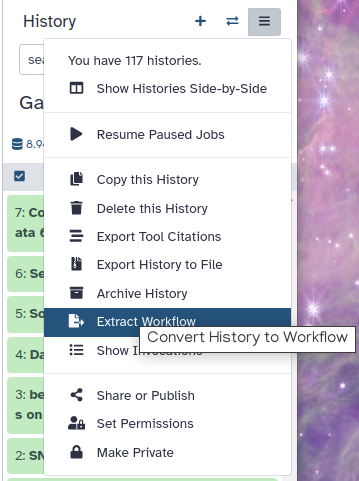
In this computer assignment, we have analyzed real RNA sequencing data to extract useful information, such as which genes are up or downregulated by IR. Your complete workflow can be extracted using the Worklows button. Do this according to this Screenshot.
Clean up your history: remove any failed (red) jobs from your history by clicking on the galaxy-delete button.
This will make the creation of the workflow easier.
Click on galaxy-gear (History options) at the top of your history panel and select Extract workflow.
The central panel will show the content of the history in reverse order (oldest on top), and you will be able to choose which steps to include in the workflow.
Replace the Workflow name to something more descriptive.
Rename each workflow input in the boxes at the top of the second column.
If there are any steps that shouldn’t be included in the workflow, you can uncheck them in the first column of boxes.
Click on the Create Workflow button near the top.
You will get a message that the workflow was created.
You can always rerun and adapt your entire workflow. A workflow as you could have obtained it can be found on this tutorial’s workflow page The output of this computer assignment can also be found in this folder on the github site.
You've Finished the Tutorial
Key points
You have learned to use DESeq2 to identify differentially expressed mRNAs
You have used PCA to identify the most important sources of variation
You have compared different clustering methods to group samples and genes
Frequently Asked Questions
Have questions about this tutorial? Have a look at the available FAQ pages and support channelsUseful literature
Further information, including links to documentation and original publications, regarding the tools, analysis techniques and the interpretation of results described in this tutorial can be found here.
References
- Young, M. D., M. J. Wakefield, G. K. Smyth, and A. Oshlack, 2010 Gene ontology analysis for RNA-seq: accounting for selection bias. Genome Biology 11: R14. https://genomebiology.biomedcentral.com/articles/10.1186/gb-2010-11-2-r14
- Tonelli, C., M. J. Morelli, S. Bianchi, L. Rotta, T. Capra et al., 2015 Genome-wide analysis of p53 transcriptional programs in B cells upon exposure to genotoxic stress in vivo. Oncotarget 6: 24611–24626. 10.18632/oncotarget.5232
Feedback
Did you use this material as an instructor? Feel free to give us feedback on how it went.
Did you use this material as a learner or student? Click the form below to leave feedback.

Citing this Tutorial
- Peter-Bram 't Hoen, Casper de Visser, Charlotte Adang, RNA-Seq data analysis, clustering and visualisation tutorial (Galaxy Training Materials). https://training.galaxyproject.org/training-material/topics/transcriptomics/tutorials/rna-seq-analysis-clustering-viz/tutorial.html Online; accessed TODAY
- Hiltemann, Saskia, Rasche, Helena et al., 2023 Galaxy Training: A Powerful Framework for Teaching! PLOS Computational Biology 10.1371/journal.pcbi.1010752
- Batut et al., 2018 Community-Driven Data Analysis Training for Biology Cell Systems 10.1016/j.cels.2018.05.012
Congratulations on successfully completing this tutorial!@misc{transcriptomics-rna-seq-analysis-clustering-viz, author = "Peter-Bram 't Hoen and Casper de Visser and Charlotte Adang", title = "RNA-Seq data analysis, clustering and visualisation tutorial (Galaxy Training Materials)", year = "", month = "", day = "", url = "\url{https://training.galaxyproject.org/training-material/topics/transcriptomics/tutorials/rna-seq-analysis-clustering-viz/tutorial.html}", note = "[Online; accessed TODAY]" } @article{Hiltemann_2023, doi = {10.1371/journal.pcbi.1010752}, url = {https://doi.org/10.1371%2Fjournal.pcbi.1010752}, year = 2023, month = {jan}, publisher = {Public Library of Science ({PLoS})}, volume = {19}, number = {1}, pages = {e1010752}, author = {Saskia Hiltemann and Helena Rasche and Simon Gladman and Hans-Rudolf Hotz and Delphine Larivi{\`{e}}re and Daniel Blankenberg and Pratik D. Jagtap and Thomas Wollmann and Anthony Bretaudeau and Nadia Gou{\'{e}} and Timothy J. Griffin and Coline Royaux and Yvan Le Bras and Subina Mehta and Anna Syme and Frederik Coppens and Bert Droesbeke and Nicola Soranzo and Wendi Bacon and Fotis Psomopoulos and Crist{\'{o}}bal Gallardo-Alba and John Davis and Melanie Christine Föll and Matthias Fahrner and Maria A. Doyle and Beatriz Serrano-Solano and Anne Claire Fouilloux and Peter van Heusden and Wolfgang Maier and Dave Clements and Florian Heyl and Björn Grüning and B{\'{e}}r{\'{e}}nice Batut and}, editor = {Francis Ouellette}, title = {Galaxy Training: A powerful framework for teaching!}, journal = {PLoS Comput Biol} }
You can use Ephemeris's
shed-tools installcommand to install the tools used in this tutorial.shed-tools install [-g GALAXY] [-a API_KEY] -t <(curl https://training.galaxyproject.org/training-material/api/topics/transcriptomics/tutorials/rna-seq-analysis-clustering-viz/tutorial.json | jq .admin_install_yaml -r)Alternatively you can copy and paste the following YAML
---
install_tool_dependencies: true
install_repository_dependencies: true
install_resolver_dependencies: true
tools:
- name: text_processing
  owner: bgruening
  revisions: 6073bb457ec0
  tool_panel_section_label: Text Manipulation
  tool_shed_url: https://toolshed.g2.bx.psu.edu/
- name: text_processing
  owner: bgruening
  revisions: 6073bb457ec0
  tool_panel_section_label: Text Manipulation
  tool_shed_url: https://toolshed.g2.bx.psu.edu/
- name: column_maker
  owner: devteam
  revisions: aff5135563c6
  tool_panel_section_label: Text Manipulation
  tool_shed_url: https://toolshed.g2.bx.psu.edu/
- name: multivariate
  owner: ethevenot
  revisions: 5526f8258e8a
  tool_panel_section_label: Metabolomics
  tool_shed_url: https://toolshed.g2.bx.psu.edu/
- name: deg_annotate
  owner: iuc
  revisions: e98d4ab5b5bc
  tool_panel_section_label: RNA Analysis
  tool_shed_url: https://toolshed.g2.bx.psu.edu/
- name: deseq2
  owner: iuc
  revisions: 9a882d108833
  tool_panel_section_label: RNA Analysis
  tool_shed_url: https://toolshed.g2.bx.psu.edu/
- name: ggplot2_heatmap2
  owner: iuc
  revisions: 48b42ee61bc5
  tool_panel_section_label: Graph/Display Data
  tool_shed_url: https://toolshed.g2.bx.psu.edu/
- name: goseq
  owner: iuc
  revisions: 602de62d995b
  tool_panel_section_label: Annotation
  tool_shed_url: https://toolshed.g2.bx.psu.edu/
- name: length_and_gc_content
  owner: iuc
  revisions: e3ba567abdf5
  tool_panel_section_label: Extract Features
  tool_shed_url: https://toolshed.g2.bx.psu.edu/
- name: table_compute
  owner: iuc
  revisions: 56a8da1f2243
  tool_panel_section_label: Text Manipulation
  tool_shed_url: https://toolshed.g2.bx.psu.edu/
- name: volcanoplot
  owner: iuc
  revisions: 3af838dc0637
  tool_panel_section_label: Graph/Display Data
  tool_shed_url: https://toolshed.g2.bx.psu.edu/