Inferring single cell trajectories with Scanpy (Python)
| Author(s) |
|
| Editor(s) |
|
| Reviewers |
|
OverviewQuestions:
Objectives:
How can I infer lineage relationships between single cells based on their RNA, without a time series?
Requirements:
Execute multiple plotting methods designed to maintain lineage relationships between cells
Interpret these plots
- Introduction to Galaxy Analyses
- tutorial Hands-on: Generating a single cell matrix using Alevin
- tutorial Hands-on: Combining single cell datasets after pre-processing
- tutorial Hands-on: Filter, plot and explore single-cell RNA-seq data with Scanpy
- tutorial Hands-on: Use Jupyter notebooks in Galaxy
Time estimation: 2 hoursSupporting Materials:
- Datasets
- galaxy-history-input Input Histories
- galaxy-history-answer Answer Histories
- Jupyter Notebook
- FAQs
- video Recordings
- instances Available on these Galaxies
Published: Apr 7, 2021Last modification: Mar 11, 2025License: Tutorial Content is licensed under Creative Commons Attribution 4.0 International License. The GTN Framework is licensed under MITpurl PURL: https://gxy.io/GTN:T00244rating Rating: 4.6 (0 recent ratings, 5 all time)version Revision: 20
Introduction
You’ve done all the hard work of: preparing a single cell matrix, processing it, plotting it, interpreting it, and finding lots of lovely genes. Now you want to infer trajectories, or relationships between cells… and you’ve been threatened with learning Python to do so! Well, fear not. If you can have a run-through of a basic python coding introduction such as this one, then that will help you make more sense of this tutorial, however you’ll be able to make and interpret glorious plots even without understanding the Python coding language. This is the beauty of Galaxy - all the ‘set-up’ is identical across computers, because it’s browser based. So fear not!
Traditionally, we thought that differentiating or changing cells jumped between discrete states, so ‘Cell A’ became ‘Cell B’ as part of its maturation. However, most data shows otherwise. Generally, there is a spectrum (a ‘trajectory’, if you will…) of small, subtle changes along a pathway of that differentiation. Trying to analyse cells every 10 seconds can be pretty tricky, so ‘pseudotime’ analysis takes a single sample and assumes that those cells are all on slightly different points along a path of differentiation. Some cells might be slightly more mature and others slightly less, all captured at the same ‘time’. We ‘assume’ or ‘infer’ relationships between cells.
We will use the same sample from the previous tutorials, which contains largely T-cells in the thymus. We know T-cells differentiate in the thymus, so we would assume that we would capture cells at slightly different time points within the same sample. Furthermore, our cluster analysis alone showed different states of T-cell. Now it’s time to look further!
AgendaIn this tutorial, we will cover:
Get data
We’ve provided you with experimental data to analyse from a mouse dataset of fetal growth restriction Bacon et al. 2018. This is the full dataset generated from this tutorial (see the study in Single Cell Expression Atlas and the project submission). You can find the final dataset in this input history or download from Zenodo below.
Hands On: Option 1: Data upload - Import history
Import history from: input history
- Open the link to the shared history
- Click on the Import this history button on the top left
- Enter a title for the new history
- Click on Copy History
Rename galaxy-pencil the the history to your name of choice.
Hands On: Option 2: Data upload - Add to history
- Create a new history for this tutorial
Import the AnnData object from Zenodo
https://zenodo.org/record/7075718/files/Final_cell_annotated_object.h5ad
- Copy the link location
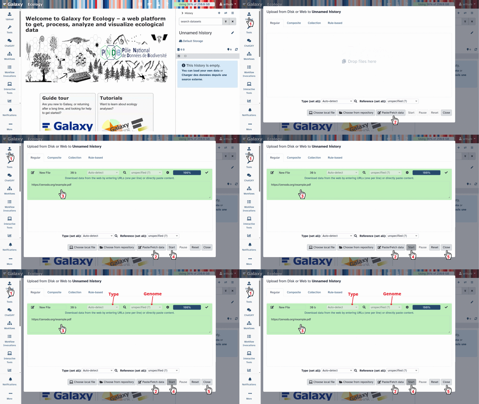
Click galaxy-upload Upload at the top of the activity panel
- Select galaxy-wf-edit Paste/Fetch Data
Paste the link(s) into the text field
Press Start
- Close the window
Rename galaxy-pencil the .h5ad object as
Final cell annotated object
- Click on the galaxy-pencil pencil icon for the dataset to edit its attributes
- In the central panel, change the Name field to
Final cell annotated object- Click the Save button
Check that the datatype is
h5ad
- Click on the galaxy-pencil pencil icon for the dataset to edit its attributes
- In the central panel, click galaxy-chart-select-data Datatypes tab on the top
- In the galaxy-chart-select-data Assign Datatype, select
h5adfrom “New Type” dropdown
- Tip: you can start typing the datatype into the field to filter the dropdown menu
- Click the Save button
Filtering for T-cells
One problem with our current dataset is that it’s not just T-cells: we found in the previous tutorial that it also contains macrophages. This is a problem, because trajectory analysis will generally try to find relationships between all the cells in the sample. We need to remove those cell types to analyse the trajectory.
Hands On: Removing macrophages
- Manipulate AnnData ( Galaxy version 0.7.5+galaxy1) with the following parameters:
- param-file “Annotated data matrix”:
Final cell annotated object- “Function to manipulate the object”:
Filter observations or variables- “What to filter?”:
Observations (obs)- “Type of filtering?”:
By key (column) values- “Key to filter”:
cell_type- “Type of value to filter”:
Text- “Filter”:
not equal to- “Value”:
Macrophages- Rename galaxy-pencil output h5ad
T-cell_object.h5ad
You should now have 8569 cells, as opposed to the 8605 you started with. You’ve only removed a few cells (the contaminants!), but it makes a big difference in the next steps.
Take note of what # this dataset is in your history, as you will need that shortly!
Launching Jupyter
Warning: Data uploads and JupyterThere are a few ways of importing and uploading data in Jupyter. You might find yourself accidentally doing this differently than the tutorial, and that’s ok. There are a few key steps where you will call files from a location - if these don’t work from you, check that the file location is correct and change accordingly!
JupyterLab is a bit like RStudio but for other coding languages. What, you’ve never heard of RStudio? Then don’t worry, just follow the instructions!
warning Please note: this is only currently available on the usegalaxy.eu and usegalaxy.org sites.
Hands On: Launching JupyterLab
- Interactive JupyTool and Notebook with the following parameters:
- “Do you already have a notebook?”:
Start with a fresh notebookThis may take a moment, but once the
Executed notebookin your dataset is orange, you are up and running!Either click on the blue
User menuthat appeared when you executed the Interactive JupyTool and Notebook, or go to the top of the screen and chooseUserand thenActive InteractiveTools.- Click on the newest
JupyTool interactive tool.
Welcome!
Warning: Danger: You can lose data!Do NOT delete or close this notebook dataset in your history. YOU WILL LOSE IT!
You have two options for how to proceed with this tutorial - either you download the tutorial notebook and run the lines in that notebook, or you can copy and paste the code for each step into a fresh notebook and run it yourself. The initial instructions for both options are below.
Hands On: Option 1A: Open the notebook directly in the JupyterLab
Open a Terminal in JupyterLab with File -> New -> Terminal
- Run
wget https://training.galaxyproject.org/training-material/topics/single-cell/tutorials/scrna-case_JUPYTER-trajectories/single-cell-scrna-case_JUPYTER-trajectories.ipynb- Select the notebook that appears in the list of files on the left.
Hands On: Option 1B: Downloading the tutorial notebook & Upload
You will need to download the tutorial notebook locally to your own computer. Do this by clicking on notebook
Jupyter notebookin theSupporting Materialssection at the very beginning of the tutorial, in the Overview box.In the folder window, galaxy-upload Upload the downloaded notebook from your computer. It should appear in the file window.
Open it by double clicking it in the file window.
Hands On: Option 2: Creating a notebook
- Click the Python 3 icon under Notebook
Save your file (File: Save, or click the galaxy-save Save icon at the top left)
If you right click on the file in the folder window at the left, you can rename your file
whateveryoulike.ipynb
Warning: You should Save frequently!This is both for good practice and to protect you in case you accidentally close the browser. Your environment will still run, so it will contain the last saved notebook you have. You might eventually stop your environment after this tutorial, but ONLY once you have saved and exported your notebook (more on that at the end!) Note that you can have multiple notebooks going at the same time within this JupyterLab, so if you do, you will need to save and export each individual notebook. You can also download them at any time.
Run the tutorial!
From now on, you can view this tutorial in the Jupyter notebook, which will allow you to read the material and simultaneously execute the code cells! You may have to change certain numbers in the code blocks, so do read carefully. The tutorial is adapted from the Scanpy Trajectory inference tutorial.
Warning: Notebook-based tutorials can give different outputsThe nature of coding pulls the most recent tools to perform tasks. This can - and often does - change the outputs of an analysis. Be prepared, as you are unlikely to get outputs identical to a tutorial if you are running it in a programming environment like a Jupyter Notebook or R-Studio. That’s ok! The outputs should still be pretty close.
Install modules & activate them
pip install scanpy
pip install igraph
pip install louvain
pip install fa2-modified
import numpy as np
import pandas as pd
import matplotlib.pyplot as pl
from matplotlib import rcParams
import scanpy as sc
Import dataset
You can now import files from your Galaxy history directly using the following code. This will depend on what number in your history the final annotated object is. If your object is dataset #2 in your history, then you import it as following:
thymusobject = get(2)
You now you need to read it in as an h5ad object.
adata = sc.read_h5ad(thymusobject)
There shouldn’t be any issues with fetching data from your Galaxy history using get() function. However, if you experience any problems, you can use the code below to download the input data and be able to follow the tutorial.
%%bash
wget -nv https://zenodo.org/records/13743145/files/Filtered_anndata.h5ad
adata = sc.read_h5ad("Filtered_anndata.h5ad")
Draw force-directed graph
First, we will calculate a force-directed graph, as an alternate to tSNE, which will likely work better for trajectory analysis.
sc.tl.draw_graph(adata)
And now time to plot it! Note: We’re saving to png, but you can also choose pdf
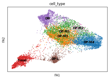
sc.pl.draw_graph(adata, color='cell_type', legend_loc='on data', save = 'Plot1.png')
 Open image in new tab
Well now this is exciting! Our DP-late is more clearly separating, and we might also suppose that DP-M1, DP-M2, and DP-M3 are actually earlier on in the differentiation towards mature T-cells. And we’re only just getting started!
Diffusion maps
We’ll now perform an optional step, that basically takes the place of the PCA. Instead of using PCs, we can use diffusion maps.
sc.tl.diffmap(adata)
Now that we have our diffusion map, we need to re-calculate neighbors using the diffusion map instead of the PCs. Then we re-draw and plot a new force directed graph using the new neighbors.
sc.pp.neighbors(adata, n_neighbors=15, use_rep='X_diffmap')
sc.tl.draw_graph(adata)
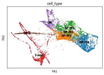
sc.pl.draw_graph(adata, color='cell_type', legend_loc='on data', save = 'Plot2.png')
 Open image in new tab
Oh dear! This doesn’t look great. Maybe the DP-M4 cells are a whole other trajectory? That doesn’t seem right. Saying that, this spreads out our T-mature cells, which makes a lot more sense when it comes to T-cell biology (we expect T-cells to differentiate into two types of T-cells, Cd8+Cd4- and Cd4+Cd8-). If you wanted to, you could also re-cluster your cells (since you’ve changed the neighborhood graph on which the clusterisation depends). You could use this:
sc.tl.louvain(adata, resolution=0.6)
However, we tried that, and it called far too many clusters given the depth of sequencing in this dataset. Let’s stick with our known cell types and move from there.
Working in a group? Decision-time!
If you are working in a group, you can now divide up a decision here with one control and the rest can vary numbers so that you can compare results throughout the tutorials.
- Control
- Go straight to the PAGA section
- Everyone else:
- you could re-call clusters
sc.tl.louvain(adata, resolution=0.6)or use other resolutions! (Tip, go low!)- Please note that in this case, you will want to change the PAGA step
sc.pl.pagato group bylouvainrather thancell_type. You can certainly still plot both, we only didn’t because with using our old Louvain calls, the cell_type and louvain categories are identical.
- Please note that in this case, you will want to change the PAGA step
-
you could undo the diffusion map step by running the following
sc.pp.neighbors(adata, n_neighbors=15, use_rep='X_pca')sc.tl.draw_graph(adata) - you could also change the number of neighbors used in the
pp.neighborsstep (this is the same as the Galaxy tool Scanpy ComputeGraph)
- you could re-call clusters
- Everyone else: You will want to compare FREQUENTLY with your control team member.
PAGA
PAGA is used to generalise relationships between groups, or likely clusters, in this case.
sc.tl.paga(adata, groups='cell_type')
Now we want to plot our PAGA, but we might also be interested in colouring our plot by genes as well. In this case, remembering that we are dutifully counting our genes by their EnsemblIDs rather than Symbols (which do not exist for all EnsemblIDs), we have to look up our gene of interest (CD4, CD8a) and plot the corresponding IDs.
sc.pl.paga(adata, color=['cell_type', 'ENSMUSG00000023274', 'ENSMUSG00000053977'], title=['Cell type', 'CD4', 'Cd8a'], save = 'Plot4.png')
 Open image in new tab
Well now that is interesting! This analysis would find that DP-M1 and DP-M4 are both driving towards differentiation, which is not something we had necessarily been able to specify before by just looking at our cluster graphs or applying our biological knowledge.
Re-draw force-directed graph
Force directed graphs can be initialised randomly, or we can prod it in the right direction. We’ll prod it with our PAGA calculations. Note that you could also try prodding it with tSNE or UMAP. A lot of these tools can be used on top of each other or with each other in different ways, this tutorial is just one example. Similarly, you could be using any obs information for grouping, so could do this for louvain or cell_type for instance.
sc.tl.draw_graph(adata, init_pos='paga')

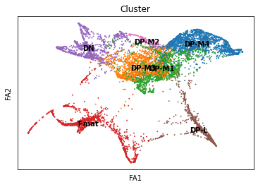
sc.pl.draw_graph(adata, color=['cell_type'], title=['Cluster'], legend_loc='on data', save = 'Plot5.png')
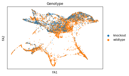
sc.pl.draw_graph(adata, color=['genotype'], title=['Genotype'], save = 'Plot6.png')
sc.pl.draw_graph(adata, color=['ENSMUSG00000023274', 'ENSMUSG00000053977'], title=['CD4', 'Cd8a'], save = 'Plot7.png')
 Open image in new tab
 Open image in new tab
 Open image in new tab
Well aren’t those charts interesting! Using the diffusion map to drive the force-directed graph, we see correct ordering of our cells (from DN to DP to T-mature, which was lost with the diffusion map alone) as well as two apparent branches leaving the mature T-cell population, which is what we’d biologically expect. In terms of our experiment, we’re seeing a clear trajectory issue whereby the knockout cells are not found along the trajectory into T-mature (which, well, we kind of already figured out with just the cluster analysis, but we can feel even more confident about our results!) More importantly, we can see the T-mature population dividing itself, which we did not see in the clustering via UMAP/tSNE alone, and we can verify that as the leftmost branch has CD4 but the rightmost branch does not. This is suggesting our branchpoint from to CD4+ and CD8+ single positive cells. Exciting! However, it is important to note, that the branches there are quite small and sparsely populated, which can indicate artifact branches (i.e. trajectory analysis does its best to find branches, particularly diffusion map, so you can pretty easily force branches to appear even if they are not biologically real!). However, to be frank, we were surprised not to find this clearer in the main cluster map, as we know that the T-cells should diverge at that point, so if anything this is a relief that our data is believable!
And now, just for fun, we can compare the scatter graph with our PAGA side by side.
sc.pl.paga_compare(
    adata, threshold=0.03, title='', right_margin=0.2, size=10, edge_width_scale=0.5,
    legend_fontsize=12, fontsize=12, frameon=False, edges=True, save=True)
 Open image in new tab
Diffusion pseudotime
We know that our cells are initialising at DN. We can feed that information into our algorithms to then calculate a trajectory.
First, let’s name our ‘root’.
adata.uns['iroot'] = np.flatnonzero(adata.obs['cell_type'] == 'DN')[0]
Working in a group? Decision-time!
If you called new clusters using the louvain algorithm, you might want to choose one of those clusters to be your root cell instead, so change the cell_type above for louvain and then name the cluster number. Use the plots you created to help you pick the number!
Onto the diffusion pseudotime, where we are infer multiple time points within the same piece of data!
sc.tl.dpt(adata)
sc.pl.draw_graph(adata, color=['cell_type', 'dpt_pseudotime'], legend_loc='on data', save = 'Plot8.png')
 Open image in new tab
This is nice, as it supports our conclusions thus far on the trajectory of the T-cell differentiation. With single-cell, the more ways you can prove to yourself what you’re seeing is real, the better! If we did not find consistent results, we would need to delve in further to see if the algorithm produced the artefacts (not all algorithms fit all data!) or the biology suprised us.
Where might we go from here? We might consider playing with our louvain resolutions, to get the two branches to be called as different clusters, and then comparing them to each other for gene differences or genotype differences. We might also use different objects (for instance, what if we regressed out cell cycle genes?) and see if that changes the results. Perhaps we would eliminate the DN double-branch input. Or perhaps that’s real, and we should investigate that. What would you do?
Working in a group? The finale!
Look at each others images! How do yours differ, what decisions were made? Previously, when calling clusters in the Filter, Plot, Explore tutorial, the interpretation at the end is largely consistent, no matter what decisions are made throughout (mostly!). Is this the case with your trajectory analyses? You may find that it is not, which is why pseudotime analysis even more crucially depends on your understanding of the underlying biology (we have to choose the root cells, for instance, or recognise that DN cells should not be found in the middle of the DPs) as well as choosing the right analysis. That’s why it is a huge field! With analysing scRNA-seq data, it’s almost like you need to know about 75% of your data and make sure your analysis shows that, for you to then identify the 25% new information.
Export your data, figures, and notebook
It’s now time to export your data! First, we need to get it Jupyter to see it as a file.
adata.write('Trajectorythymus.h5ad')
Now you can export it, as well as all your lovely plots! If you go into the figures folder at the left, you’ll see your lovely plots and can choose which ones to export. The following code will push them into your galaxy history. You can also directly download them onto your computer from the file window at the left.
put("Trajectorythymus.h5ad")
put("figures/draw_graph_faPlot1.png")
put("figures/draw_graph_faPlot2.png")
put("figures/draw_graph_faPlot5.png")
put("figures/draw_graph_faPlot6.png")
put("figures/draw_graph_faPlot7.png")
put("figures/draw_graph_faPlot8.png")
put("figures/paga_compare.pdf")
put("figures/pagaPlot4.png")
The cell below will only work if you haven’t changed the name of the notebook. If you renamed it, simply type its new name in the parenthesis.
put("single-cell-scrna-case_JUPYTER-trajectories.ipynb")
This may take a moment, so go check your Galaxy history to make sure your images, anndata object, and notebook (.ipynb) have all made it back into your Galaxy history. Once they are all there, you can exit this browser and return to the Galaxy tutorial!
If things have gone wrong, you can also download this answer key tutorial.
Citation
Please note, this is largely based on the trajectories tutorial found on the Scanpy site itself https://scanpy-tutorials.readthedocs.io/en/latest/paga-paul15.html.
After Jupyter
Congratulations! You’ve made it through Jupyter!
Hands On: Closing JupyterLab
- Click User: Active Interactive Tools
- Tick the box of your Jupyter Interactive Tool, and click Stop
If you want to run this notebook again, or share it with others, it now exists in your history. You can use this ‘finished’ version just the same way as you downloaded the directions file and uploaded it into the Jupyter environment.
Conclusion
Congratulations! You’ve made it to the end! You might be interested in the Answer Key History or the Answer Key Jupyter Notebook. If, for some reason anything didn’t work in Galaxy JupyterLab environment, please don’t get discouraged - we prepared a Google Colab notebook version for you as a backup so that you can enjoy the tutorial no matter what!
In this tutorial, you moved from called clusters to inferred relationships and trajectories using pseudotime analysis. You found an alternative to PCA (diffusion map), an alternative to tSNE (force-directed graph), a means of identifying cluster relationships (PAGA), and a metric for pseudotime (diffusion pseudotime) to identify early and late cells. If you were working in a group, you found that such analysis is slightly more sensitive to your decisions than the simpler filtering/plotting/clustering is. We are inferring and assuming relationships and time, so that makes sense!
To discuss with like-minded scientists, join our Gitter channel for all things Galaxy-single cell!
